The main tools used for our analysis were HTA diagrams for user task analysis, affinity diagrams (created in Figma) for data categorization and Atlas.ti data coding, which unfortunately proved to be more of nuisance as for such a small data set.
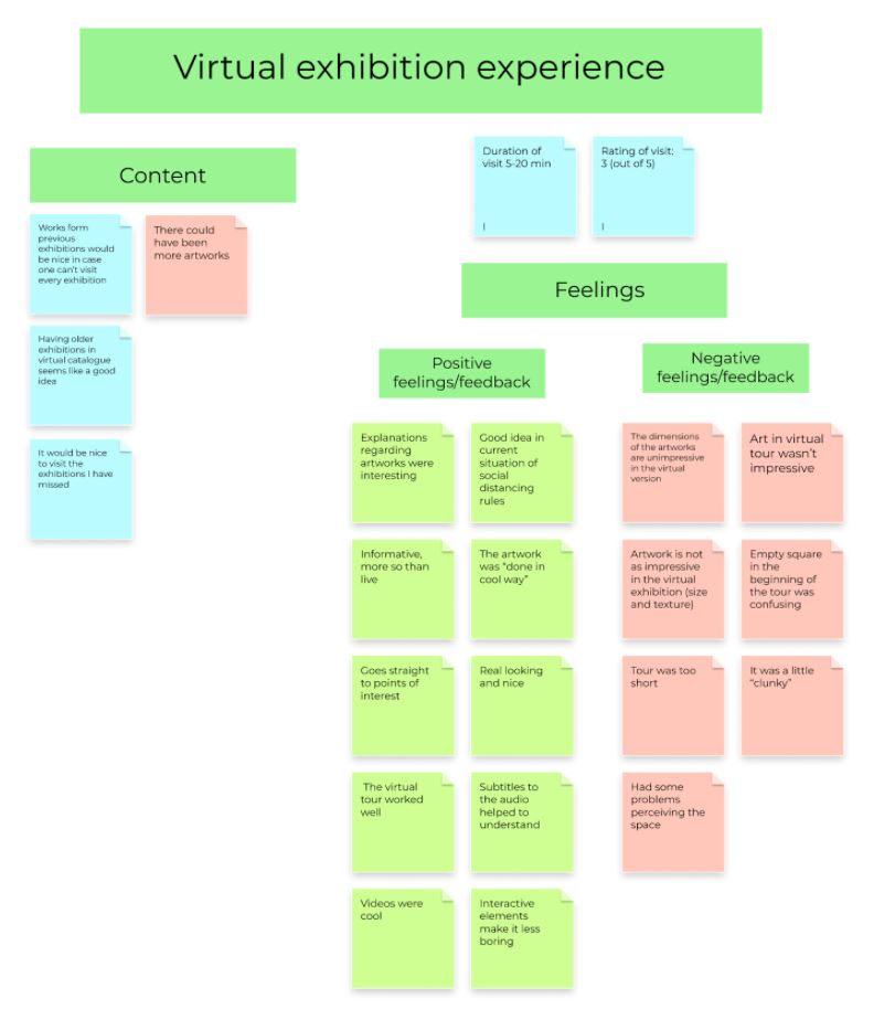
Affinity diagrams
Navigation in the virtual space provoked many thoughts in the interviewees so we decided to give it a category of its own. The data shows that while some participants struggled with the navigation and moving around in the virtual space, others didn’t have major problems with it. We also asked the participants about their attitudes toward using the virtual Amos Rex with VR and these responses formed into their own category, mainly with positive findings but also a few notes about availability and accessibility of VR equipment. In the last category, other remarks, we collected all other findings that did not occur enough to form a category of their own. These included, for example, remarks about participants not noticing different buttons, comments about viewing angles and issues with syncing audio and video.
For findings related to both the virtual and live exhibition, we ended up with two categories: virtual to live opinions, that includes data about whether or not the virtual exhibition would inspire visitors to visit the physical museum, and virtual vs live with findings about comparing the virtual and physical museum. In general, the data seemed more negative towards the virtual experience as many participants thought that the virtual visit could not replace the physical visit but there were some positive notes about how especially now during the pandemic, the virtual version can be a nice option to have. Many participants also thought that the virtual visit could inspire them to visit the actual museum even though some of them noted that the experience would probably not be as good if they had already seen the same works online.
Hierarchical task analysis
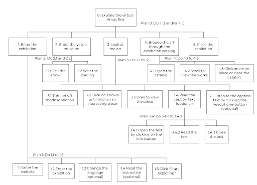
As our problem space has a clear division into physical and virtual space, we decided to model the users’ main tasks in both environments. We approached the physical space from the perspective of the first user group (see figure 1) and the virtual space from the perspective of the fourth (see figure 2). Below are the main tasks represented as hierarchical task analysis diagrams.
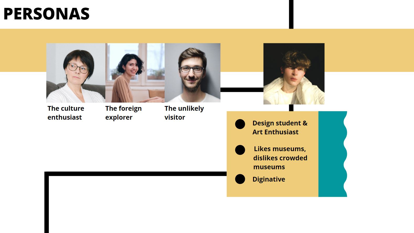
User personas
As our problem space has a clear division into physical and virtual space, we decided to model the users’ main tasks in both environments. We approached the physical space from the perspective of the first user group (see figure 1) and the virtual space from the perspective of the fourth (see figure 2). Below are the main tasks represented as hierarchical task analysis diagrams.
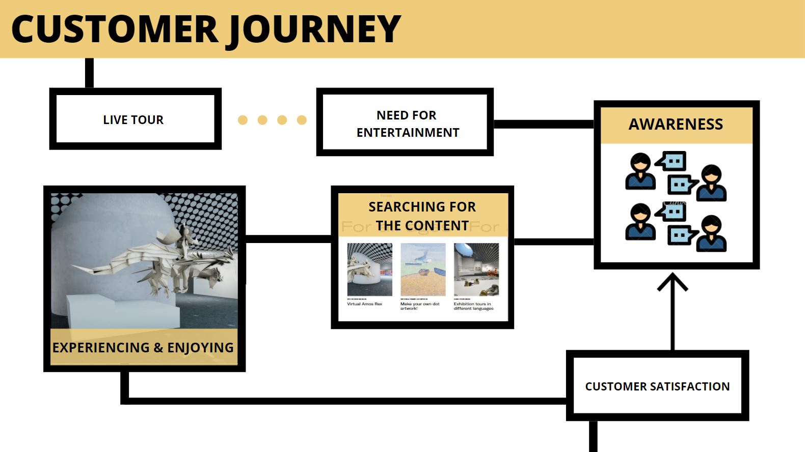
Customer journey
We decided to create a customer journey from the perspective of our secondpersona Konsta, who has experienced the physical museum tour first and thevirtual museum tour afterwards. The journey thus includes both the physical andthe virtual museum visit to create a more comprehensive customer journey map.