SPORTMATES
Web design / UI&UX design
Released on 14.11.2020
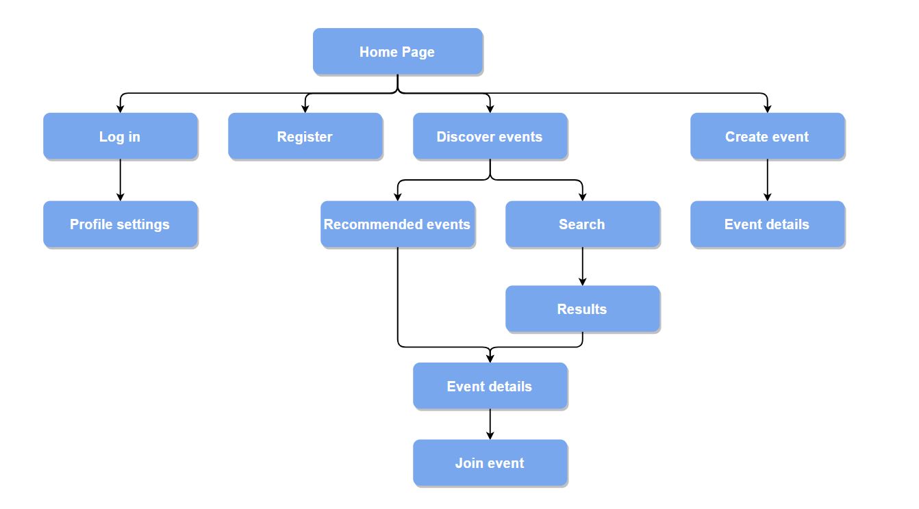
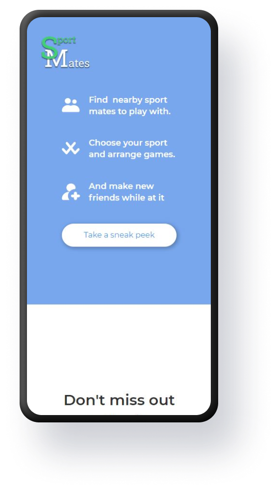
Sportmates was Aalto University project for a web development course for we had to create a website with proper functionalities. Sportmates is a web based service aimed for people interested in any kind of sports. Our goal is to help its users to find other people with similar interests in sports and arrange matches and other kinds of sport related activities.
Sportmates has a solid use case and business, and currently there is no web service that caters to active people looking to find people to be active with. Although this was built as school project it certainly has potential to be commercially released, but of course it would further development.
The core features are:
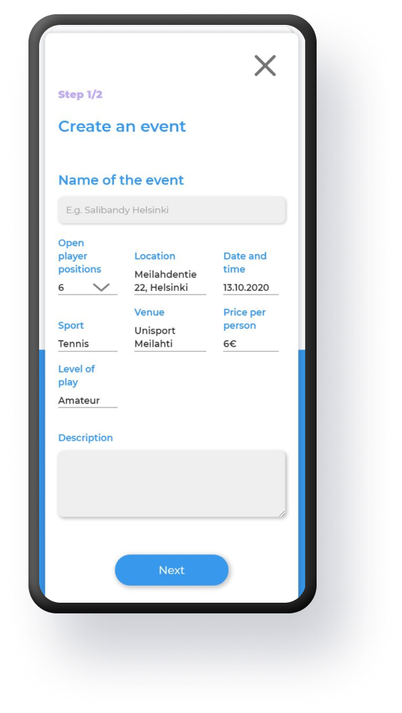
- Event creation and sharing: Users of Sportmates are able to create sport related events and publish them for everybody. After this, other users will be able to notify their interest, add event related comments and join the events.
- Personal accounts: Users are also able to create a personal account and list what kind of sports he or she is interested in and what level of expertise he or she has in those sports.
- Sport discovery: If the user is interested in trying new sports, Sportmates has also a discovery feature, where users can find all the events in their local area and filter those by sport, location, time and level of play.
key elements and themes of the project
Project details
01
user groups & use cases
Responsive design for all devices.
02
overall design
Responsive design for all devices.
03
Front-end & back-end
Responsive design for all devices.
04
responsiveness
Responsive design for all devices.

.png)


