User flows
I created four different user flows to better grasp what kind of functionalities the app would require. I created one for the onboarding sequence, browsing the homepage, searching and making a purchase. These would serve as a reference when creating the wireframes later on. These user flows weren't of course set in stone and functionalities where added when they came up to mind. In the figure below you can one of the user flows, the rest can be found on the Figma file
Structure of the site
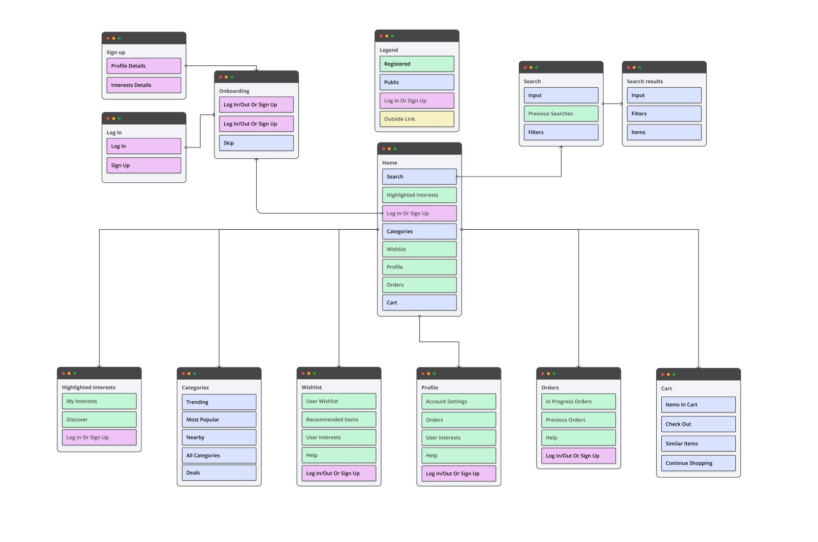
After the user flows, I created a sitemap to help structure the wireframes. With the help of a community UI Kit I created several wireframes to help guide my design of the app. UI Kits are a great way to speed up the workflow. They can be customized with ease which is always helpful. Each color represent the accessibility of the section. The blue color represents public access and green color represent registered access.
Wireframes
I created four different user flows to better grasp what kind of functionalities the app would require. I created one for the onboarding sequence, browsing the homepage, searching and making a purchase. These would serve as a reference when creating the wireframes later on. These user flows weren't of course set in stone and functionalities where added when they came up to mind. In the figure below you can one of the user flows, the rest can be found on the Figma file.
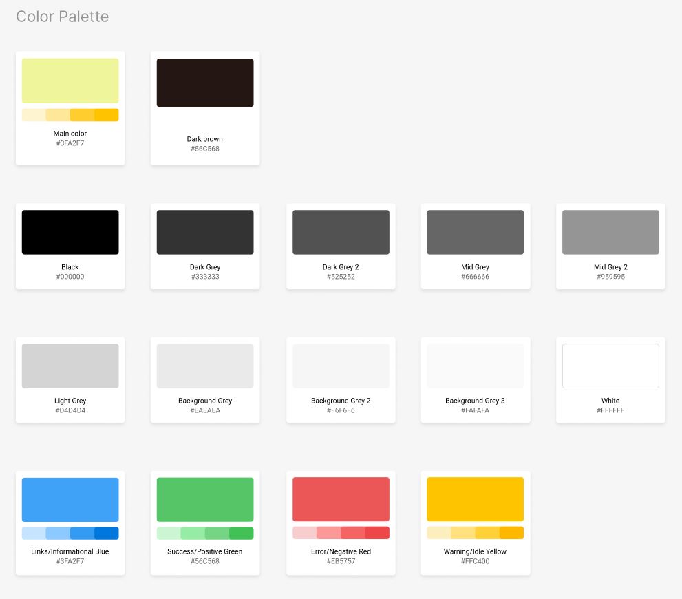
Colors
The visual design exploration started with playing with different color combinations. A light yellow color worked well with dark brown and light grey as background. These three would be my primaries but I added different shades of the primaries to my styles in case I would need them. I did also add a possibility for users to change the background color but in order to implement this more testing would need to be done to ensure contrast levels would be acceptable.
Fonts
Next, I explored typography options. I picked four fonts - Lato, Inter, Montserrat and Open sans- to test legibility on a simple layout. Lato was the first one to go as the numbers weren't as legible. Montserrat is great but I decided to try something new this time. Open Sans and Inter are very similar in a lot of ways so I coin flipped it and picked Inter.
Visual exploration
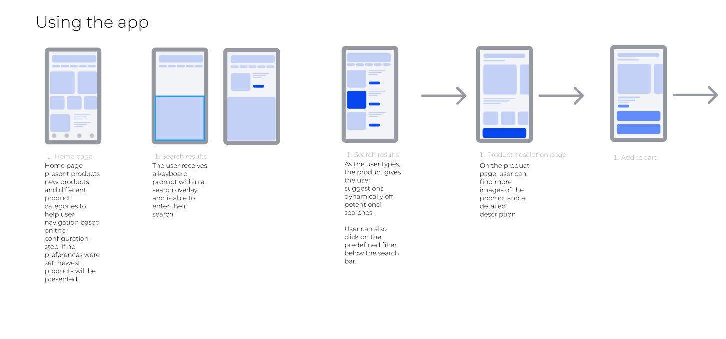
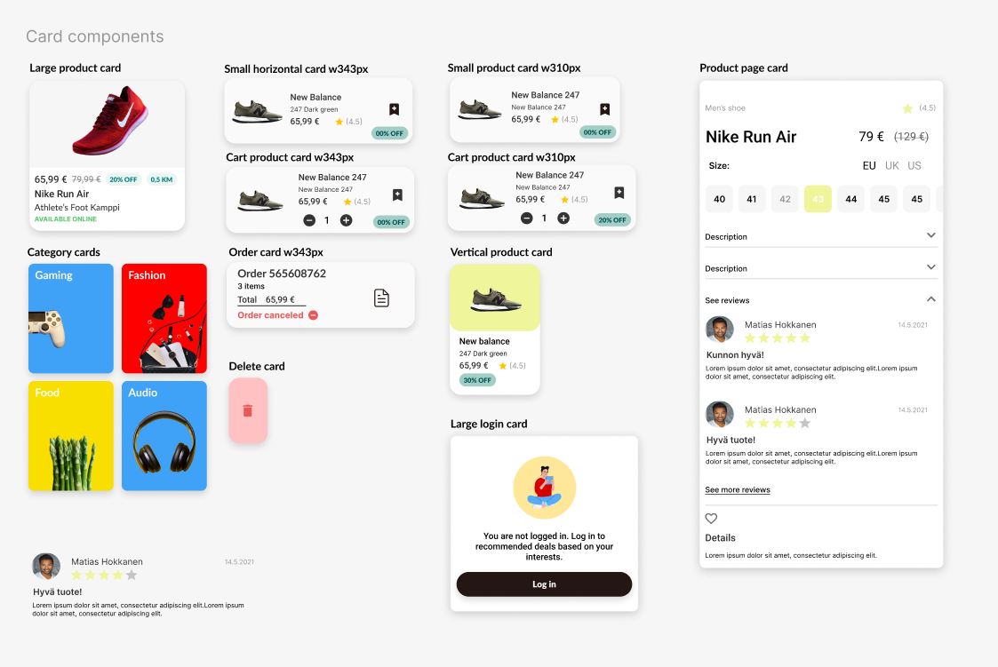
Next, I started to create somewhat high fidelity frames for the app to get a sense of its visual identity and layout options. I took inspiration from Youtube's UI and Wolt's UI as they both had specific elements that fit my app. Youtube desktop viewport uses filtering bar where is has different points of interest layout in a row which makes easy for users to filter large amount of products to find something that would likely interests them. I added a similar filtering system to my app as well as it decreases the amount clicks/taps the user has to make in order to search something. I took inspiration of Wolt's card UI with its rounded corners to give the app a more friendly appearance.
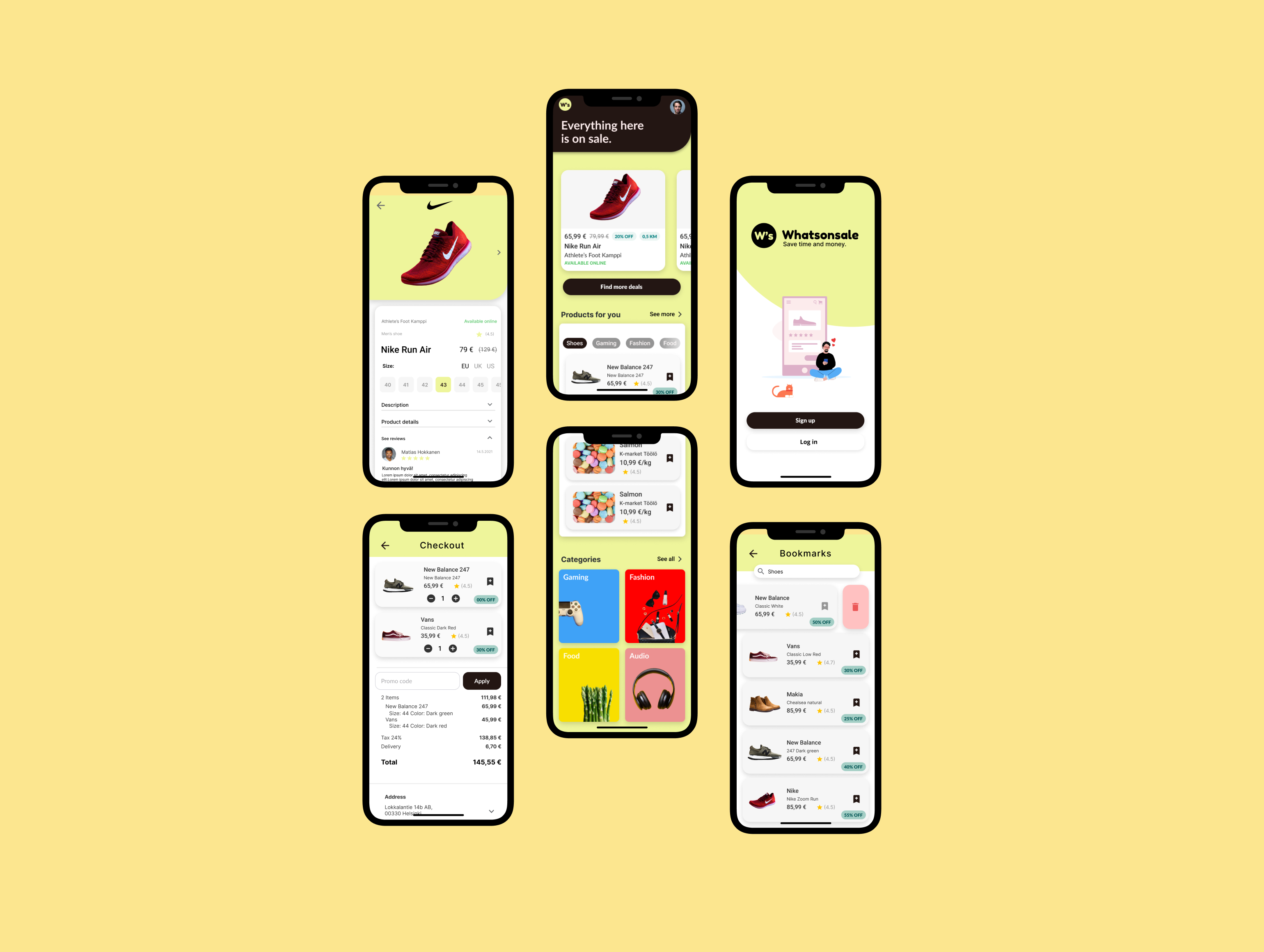
Final composition
Perhaps foolish me of to create the final composition straight on top of my visual exploration frames in terms documentation as now I am missing a piece of my process. Below you can see the prototype in action.
The registration user flow takes inspiration from best practices I've encountered both from using different application and exploring different registration UI's in Pinterests and Dribbble.
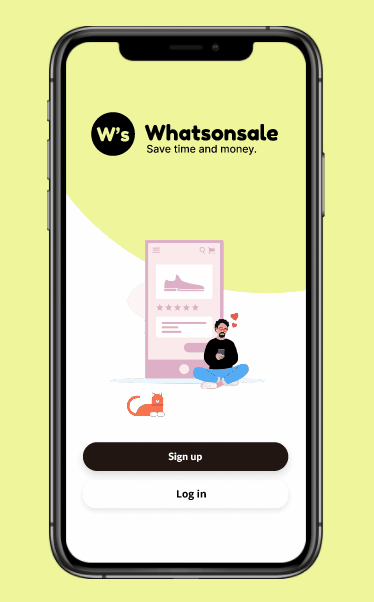
The onboarding user flow is quite straightforward. It shortly explains the app to the users and ask users for their interests in order to tailor the home screen based on the choices they made. This can be skipped and interests can added later. I found the great illustrations with Figma's Blush plugin. I was lucky enough to find illustration that fit the brands image.
The onboarding user flow is quite straightforward. It shortly explains the app to the users and ask users for their interests in order to tailor the home screen based on the choices they made. This can be skipped and interests can added later. I found the great illustrations with Figma's Blush plugin. I was lucky enough to find illustration that fit the brands image.