LIITTO
web design / web development
To be released
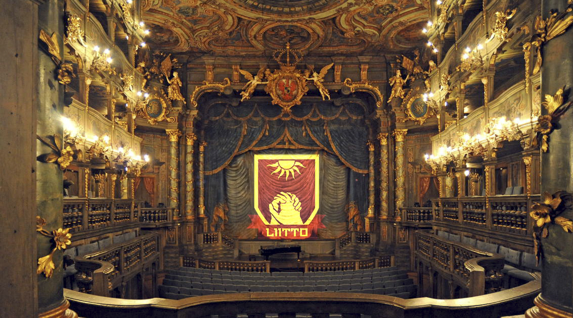
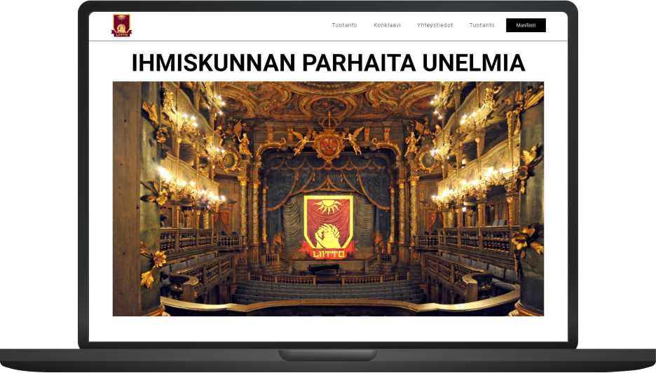
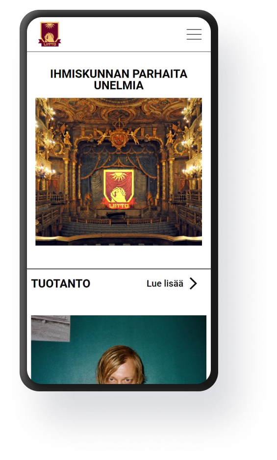
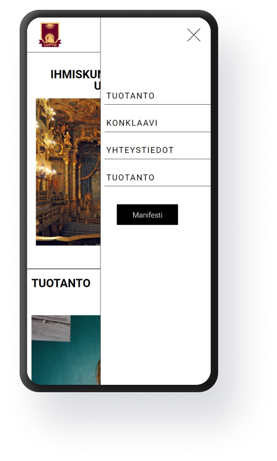
Liitto is a new generation production company based in Finland. Liitto did not yet have their own website, so the website would have to be made from ground up. The website would mainly be a marketing website but would also have a blog for content creation. Webflow is an excellent tool for building visually pleasing marketing websites where robust backend solutions aren't needed.
The whole process consisted of five parts:
- Discussion: mapping out the needs and wants as well as setting a scope for the project.
- Ideation: finding inspiration and ideas, and validating the ideas
- Planning and prototyping: content structure map and Figma layout for each page
- Development: building the website with Webflow using the Adobe XD layouts.
- Giving the keys: instructing the client on the use of a Webflow website and giving the client the "keys" to the website
key elements and themes of the project
Project details
01
co-design
Responsive design for all devices.
02
responsiveness
Responsive design for all devices.
03
content management system
Responsive design for all devices.